Coloring provides more than a calming break; it is a method of studying color theory and filling blank pages with life. Whether you are coloring a complex flower or finishing a graphic design, Color theory concepts will provide your piece with a leap from arbitrary colors to a harmonious piece. This book is a manual for adult colorists, with tips to enhance your ability. Using pages from Trending Coloring, you can apply what you have learned and observe your coloring enhance.

Let's learn about color theory
What Is Color Theory and Why It Matters
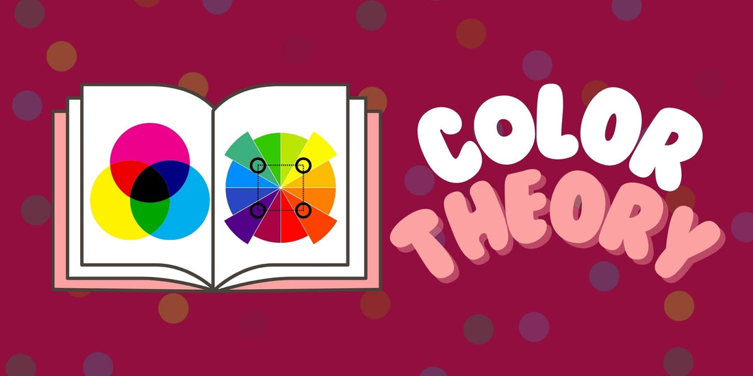
Color theory is a system for color functionality developed from Sir Isaac Newton's circular sequence of color, which he initially documented. It is made up of primary colors (red, blue, and yellow), secondary colors (orange, green, and purple), and tertiary colors (red-orange and blue-green). This is not trivial information to colorists, but rather a working palette selection guide to contrast or complement, making your work better. Coloring has been found to be a stress reducer through research, and using color theory in coloring provides a degree of artistic control, making each session more gratifying. It is a question of knowing why a red flower is a drama with green leaves and not simply that it is pretty.
The Color Wheel: Your Foundation
 Coloring Wheel
The color wheel is your starting point. Primary colors are the core; you can’t mix other hues to make them. Secondary colors arise from blending two primaries (red plus blue equals purple), and tertiary colors mix a primary with a secondary (red plus orange makes red-orange). This wheel reveals relationships: colors opposite each other, called complementary, create bold contrast, while neighbors, known as analogous, flow together smoothly. Pages from Trending Coloring, like their spring scenes, let you test these pairings, bringing theory into practice with every stroke.
Key Color Relationships
Understanding these relationships helps you choose colors with purpose:
- Complementary Colors: Opposites on the wheel, like red and green or blue and orange, offer high contrast. Use them to make elements stand out, such as a red bird against green foliage.
- Analogous Colors: Adjacent hues, such as blue, blue-green, and green, blend seamlessly. They’re great for a calming effect, like a sunset fading from yellow to orange.
- Triadic Colors: Three evenly spaced hues, like red, yellow, and blue, balance vibrancy and harmony. Try them on a mandala for a lively yet unified look.
- Monochromatic Colors: Shades of one hue, like light blue to navy, add depth without clashing. Perfect for a single-tone portrait or grayscale design.
Understanding Color Dynamics
Warm vs. Cool Colors
Colors carry emotional weight through their temperature. Warm colors (reds, oranges, yellows) feel energetic and bold, reminiscent of fire or sunlight. Cool colors (blues, greens, purples) bring calm and peace, evoking water or shade. Mixing them creates balance; a warm flower against a cool sky feels dynamic yet grounded. Experiment with this on a Trending Coloring page featuring mermaids or florals, using warm corals and cool blues to see the mood shift.
Using Color Value: Light and Dark
Value is a color’s lightness or darkness, crucial for adding dimension. A light pink petal with dark pink shadows looks three-dimensional, while flat color stays two-dimensional. Grayscale pages from Trending Coloring naturally suggest value, with darker areas for shadows and lighter ones for highlights, making it easier to add depth with light and dark shades.
Creating Color Harmony
Harmony happens when colors feel right together, pleasing the eye. Complementary pairs grab attention but can overwhelm; temper them with neutrals like gray or beige. Analogous schemes soothe but might lack punch; add a complementary accent for balance. Triadic colors energize but need careful blending to avoid chaos. Monochromatic schemes are subtle yet striking with value shifts. Test these ideas on Trending Coloring’s variety of pages to find what resonates.
Tools and Techniques to Apply Color Theory
Your tools bring theory to life. Colored pencils excel at layering value and blending analogous hues; soft cores work best for smooth transitions. Markers shine with bold complementary contrasts, offering vibrant, even coverage. Watercolor pencils blend warm and cool tones with a wet brush, adding flexibility. Techniques include layering (building colors slowly for depth), blending (smoothing transitions with a pencil or marker tip), and blocking (filling areas with solid color for abstract effects). Paper choice matters: smooth for markers, toothy for pencils. Trending Coloring’s grayscale pages enhance realism, while bold outlines suit abstract play.
Tips for Applying Color Theory in Coloring
 Applying color theory
Here’s how to put color theory into action:
- Choose Your Tools: Colored pencils excel at layering value and blending analogous hues; soft cores work best for smooth transitions. Markers shine with bold complementary contrasts, offering vibrant, even coverage. Watercolor pencils blend warm and cool tones with a wet brush, adding flexibility. For blending tips, check out How to Blend Colors Like a Pro on Trending Coloring’s blog.
- Match Paper to Medium: Use smooth paper for markers to prevent bleeding, and toothy paper for pencils to hold layers. Trending Coloring’s grayscale pages enhance realism, while bold outlines suit abstract play.
- Start Simple: Pick a page and try an analogous scheme—green, yellow-green, yellow—on a nature scene for a soothing effect. Then test a triadic trio—red, blue, yellow—on a mandala for vibrancy. Use a grayscale page for a monochromatic run—blues from pale to deep. For guidance, see Choosing the Right Colors.
- Layer and Blend: Build colors slowly with pencils for depth, ideal for realistic shading, or smooth transitions with a marker tip for analogous flows. Blocking fills areas with solid color for abstract triadic effects.
- Experiment with Styles: Realism loves analogous or monochromatic schemes for natural looks, while abstract thrives on complementary or triadic bursts. Mix them—a realistic face with an abstract triadic background—for variety. Explore more in Exploring Different Coloring Styles.
Why Color Theory Enhances Coloring
Color theory turns coloring into a deliberate craft. It’s not just about picking favorites; it’s understanding why they work together. A complementary red-green pair feels festive, while an analogous blue-green calms. It adds intention, making your pages cohesive and expressive, keeping your hobby dynamic and fun.
Applying color theory is like cracking a creative code. It’s rewarding to see a page shift from scattered to stunning with a thoughtful palette. It deepens the mindfulness of coloring, adding a layer of purpose that’s both calming and empowering. Whether you’re soothing yourself with cool tones or energizing with warm ones, you’re in charge. Share your work with friends or online to spark ideas and see your skills grow.
Start Your Color Journey
Ready to color with intent? Go to Trending Coloring for sheets that invite you to find out—grayscale for detail, bold for abstraction. Pick a palette, pick up your pencils, and begin. With complementary contrasts to analogous blends, color theory is your compass. Make it your own, share it with friends, and experience a colorful adventure—one color at a time.